Design Portfolio
Designer by Training, Storyteller by Nature
Hi there! I'm Aysa - think 'eye-sa' like eye, or icecream.
I am a Graphic Designer with creative beginnings in the performing arts. I'm passionate about creating experiences that resonate through images, words, and shared moments. With a formal design education and music theatre training, I capture attention, spark curiosity, and move people through story.
My background on stage taught me the power of collaboration, improvisation, and empathy. These skills now shape my design practice, where I thrive in ensemble settings, balance structure with play, and always design with clarity and connection at heart.
For me, design and performance share the same purpose: to make people feel, reflect, and engage. Each piece reflects creativity across disciplines with storytelling always at the core.
Projects
Project: Their Period Co. Packaging + Strategy
Client: Essity Australiasia & LGBTQIA+ Health Australia
Description/rationale:
This project reimagines period care through an inclusive, story-driven lens. Developed in partnership with LGBTQIA+ Health Australia and Essity Australiasia, the brief focused on designing packaging and campaign touchpoints that move beyond the traditional, feminine-coded mould. The solution created space for trans and gender-fluid identities by de-gendering design, sparking conversations, and addressing stigma through visibility. From packaging to digital storytelling, the outcome fosters openness, empathy, and representation across physical and digital platforms.
From packaging to digital storytelling, the project fosters openness, empathy, and representation across physical and digital platforms. The campaign is brought to life through a full-scale interview plus three reels, all of which can be viewed on my Instagram page to see the project in action. (Wix does not support youtube shorts where the reels are posted)
Roles: Branding & Identity Designer, Packaging Designer, Graphic Designer, Advertising Designer, Copywriter, Photographer / Videographer
Project: RBGV Annual Report 2017 - 2018
Client: Royal Botanic Gardens Victoria (RBGV)
Description/rationale:
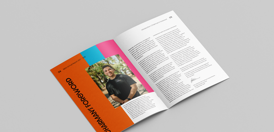
This design frames the Royal Botanic Gardens Victoria as a sanctuary within the city, a place where the noise of daily life gives way to calm, reflection, and human connection with nature. The design draws on colour-graded photography to evoke atmosphere and emotion, balanced by strong, clean typography that mirrors the structure and intention of a cultivated garden. A four-column grid in the brand’s colours builds a visual rhythm throughout, while colour-blocked financials highlight key insights. The report becomes both informative and restorative, reflecting the Gardens as approachable, purposeful, and essential to wellbeing.
Roles: Publication, Typesetting & Layout Design
Project: The Reef Loves You Back Campaign Strategy
Client: Reef Safe Sunscreen Australia
Description/rationale:
The Reef Loves You Back tells the story of how a simple choice can protect one of the world’s greatest natural treasures. Many Australians are unaware that common sunscreens harm coral and contribute to reef damage. This campaign invites people to choose kindness by switching to reef-safe alternatives, reminding them that when you care for the Reef, it cares for you in return. Through approachable design and clear communication, the campaign sparks awareness, inspires change, and supports the long-term health of the Great Barrier Reef for generations to come.
Roles: Branding Identity, Campaign Collateral, Information, Advocacy & Merchandise design
Project: La Magie du Cinema: The Staging of Michel Gondry (Coffee Table Book)
Client: ACMI (Australian Centre for the Moving Image)
Description/rationale:
This publication tells the story of cinematic innovation through the lens of Michel Gondry, tracing how pioneers like Georges Méliès and Busby Berkeley shaped his playful, imaginative style. Film’s magic, illusion, and escape are echoed in a design language of collage, bold typography, and a black-and-white palette that invites the audience’s imagination. A burst of yellow brings joy and spontaneity, reflecting the shared humour and creativity that connect these legendary storytellers across time.
Roles: Layout Designer, Typesetting, Image Curation and Creation, and Design Production
Project: The Secret Garden Classic Reboot
Client: Hawthorn Publishers
Description/rationale:
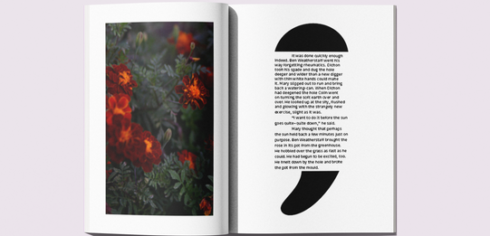
As a storyteller in design, I reimagined The Secret Garden as a therapeutic escape for adults facing anxiety, depression, and burnout. The publication unfolds like a journey of secrets and transformation: a tearaway enclosure invites change, a seed paper bookmark grows new life, and semicolon symbolism speaks of resilience. A shift from black-and-white to color mirrors the narrative’s turning point, creating an immersive visual story of healing, hope, and renewal that honors the novel’s legacy.
Roles: Publication & Layout, Print & Production, Typesetting and Concept Design.


